Heart Monitor App Design And Production Stages
HRIT | Mobile application for maintaining a healthy heart — Design Process.
![]()
Emergencies come without a prior warning. It can come to anyone, anywhere, anytime. The reaction time is really less, and with all the anxiety kicking in, we often panic.
Ever felt so helpless, that you had no idea what to do during a health emergency?
If yes, this is for you. If no, it is for you too. There might be someone, somewhere needing this vital piece of information. Be a good Samaritan.
So here it goes…
"Like all forms of design, visual design is about problem-solving, not about personal preference or unsupported opinion." — Bob Baxley
Gone are the days when smartphones were a luxury. Apps are basic these days. Since smartphones are an extension of us, apps are a tool that enhances that extension. Personal assistance, of other things, are perks of having a smartphone.

Heart disease now is the leading individual cause of disease burden in India, and stroke is the fifth leading cause.
I have had a close encounter with this issue, so I would really like to contribute towards overcoming the problem. On researching further about this, I derived that the treatment for cardiovascular diseases (CVD) is expensive, time taking and tedious. Currently, the world is taking measures to develop the best treatments and medical facilities to tackle them but there is hardly anyone focussing on its prevention.
Our body constantly gives signals about the anomalies and issue with it, and there are technologies that help us to understand it, but there is no proper implementation as of now. Smartphones and smartwatches are smart enough to scan heart rate and monitor blood pressure, which can be used to detect the irregularities if integrated and implemented in a proper manner. That could help the user be aware of the problem in his body.
My efforts are directed towards finding a solution to detect CVDs while it is still avoidable so that one can keep off the hassle of expensive treatments, medications, and hospital bills while making sure that the family knows about the condition before it is too serious.
Design Process
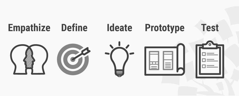

"Design is the intermediary between information and understanding " — Hans Hoffman
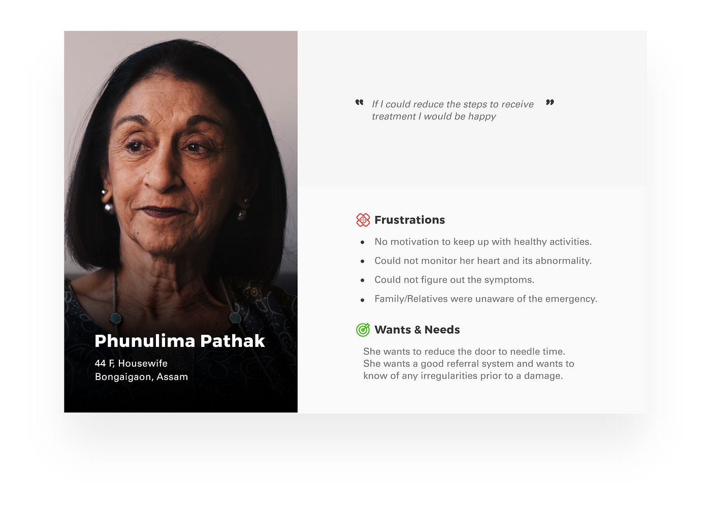
In order to empathize the problems faced, I conducted an interview with a few people aged 40+, as to understand the aftermath of the disease and the experience they went through.
Most of them could not figure out the symptoms and early signs the body tried to show. They and their relatives were not quite aware of the problems the heart was going through. Most of them would have sought early treatment if they could have found any abnormality before. They want to take care of their health, but they lack the motivation and end up not doing much about it.
After detailed interactions with doctors, I concluded that most of them had a generic answer, "most patients don't bother traveling all the way to a hospital just because they got a hunch or somebody told them. They wait until its too late and suffer damage."
They also mentioned some symptoms are so vague and acute that it is hard to identify.
One of the common symptoms of heart disease is an arrhythmia, and if detected in the right time patient can be diagnosed early and prevent any damage.
Mapping the Stakeholders
Primary stakeholders may include customers, employees, stockholders, creditors, suppliers, or anyone else with a functional or financial interest in the product or situation.
Primary stakeholders in this case:
- Patients
- Caregivers
- Clinicians
- Health Facilities
Secondary stakeholders are usually external stakeholders, are those who although they do not engage in direct economic exchange with the business are affected by or can affect its actions.
Secondary stakeholders in this case:
- Heart patients
- Health conscious people
- Family
- Friends
- Guardian
- Relatives
- Clinical pharmacist
- Nurse practitioner
- Physicians
- Imaging & radiology centers
- Clinics
- Hospitals
- Nursing homes
Tertiary stakeholders are external actors who neither make business decisions nor benefit directly from the operations or products of the business
but nonetheless, have the ability to influence these decisions
Tertiary stakeholders in this case:
- Nutritionists
- Dieticians
- Physiotherapists
- Researchers
- Medical Suppliers
- Government
- NGOs
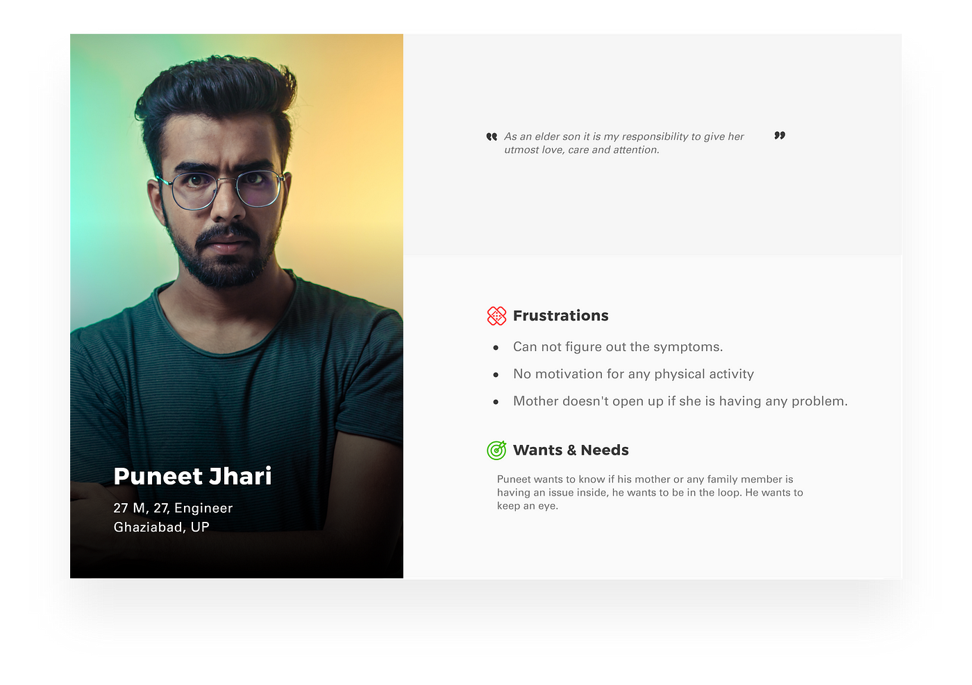
Creating User Personas
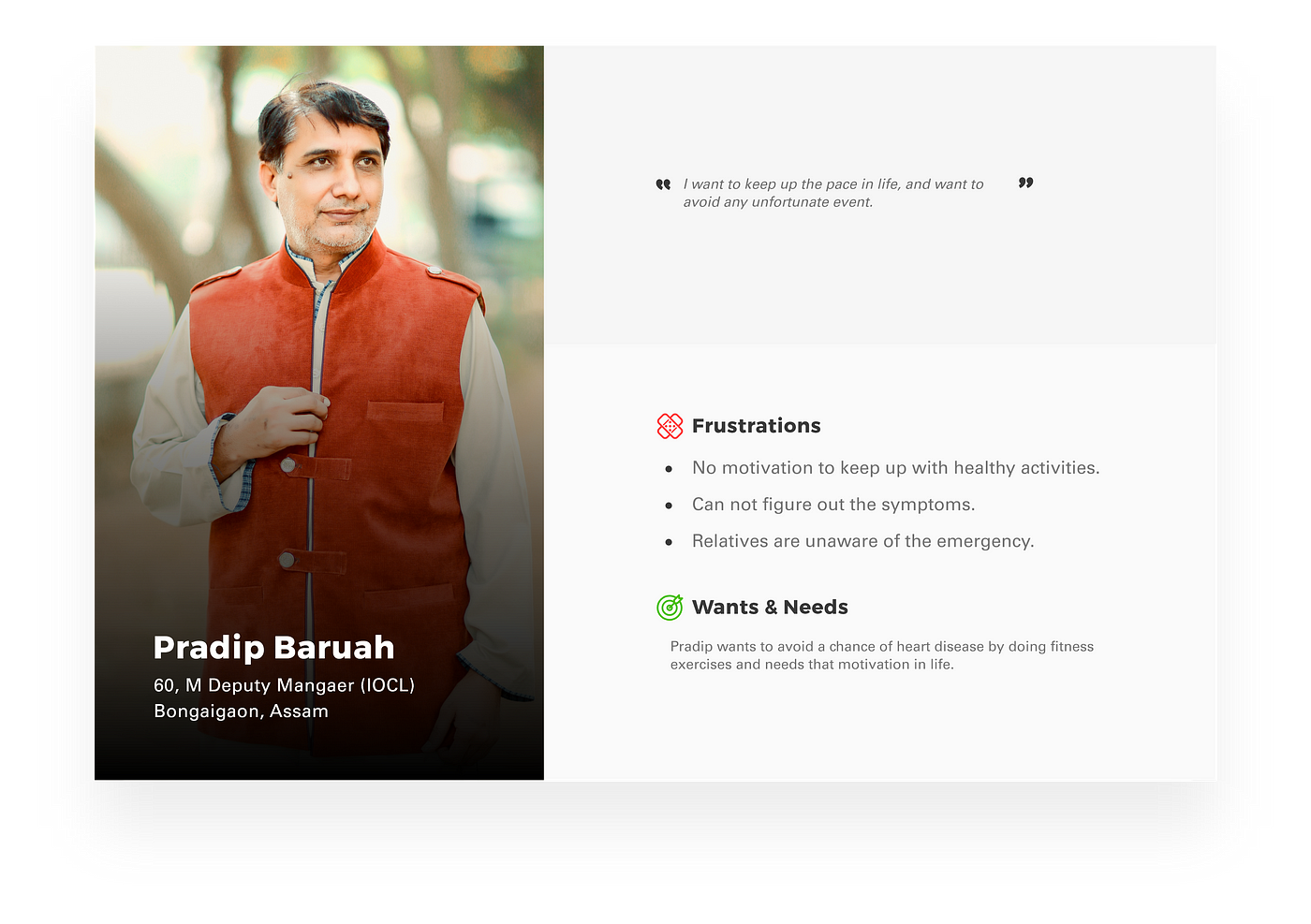
User Journey Mapping
Here, the user journey is mapped in order to better understand the persons day of the incident and make improvements, or finding the pain points based on a desired specification or story.
"To be a great designer, you need to look a little deeper into how people think and act." — Paul Boag

An integral part of the Design Thinking process is the definition of a meaningful and actionable problem statement. — by Rikke Dam and Teo Siang
People have had a hard time managing for a healthy heart. Even if they haven't been diagnosed with heart disease, they are still unaware of the risk it possesses. There aren't many solutions which a person can use to identify an attack, because symptoms are sometimes vague and acute.
On researching further about this, I derived that the treatment for cardiovascular diseases (CVD) is expensive, time taking and tedious. Currently, the world is taking measures to develop the best treatments and medical facilities to tackle them but there is hardly anyone focussing on its prevention.
The atrocities of certain medical institutes often lead to the naive patient falling trapped to a number of tests that can be ignored, which were not necessary in the first place.
Defining the Target Audience
After defining the problem statement above, I will focus on the people from the age of 24–70.

To make a mobile application which detects, alerts about any abnormalities to us and our family, and motivates the user to maintain a healthy heart.

Machine learning has been playing an important role in the evolution of technology and human life.
For my application, Supervised Machine Learning Algorithms can apply what has been learned in the past to new data using labeled examples to predict future events. It can not detect a heart attack directly, but if we provide it with necessary details and let it learn about us, it can calculate the risk factors depending on how big or small the anomaly is and notify us on the level of emergency.

Application Identity
An icon directly represents (or shows us) an idea, concept, operation or action. Icons simplify or summarize an operation through a graphical representation, and relays this to the user.
Icons are commonly used in applications (or apps), to represent what the app does, and are a key element in the User Interface.
It would be good to have something unique which catches the attention of the target group. Something unique yet relatable words would be perfect to go with.
Possible Names
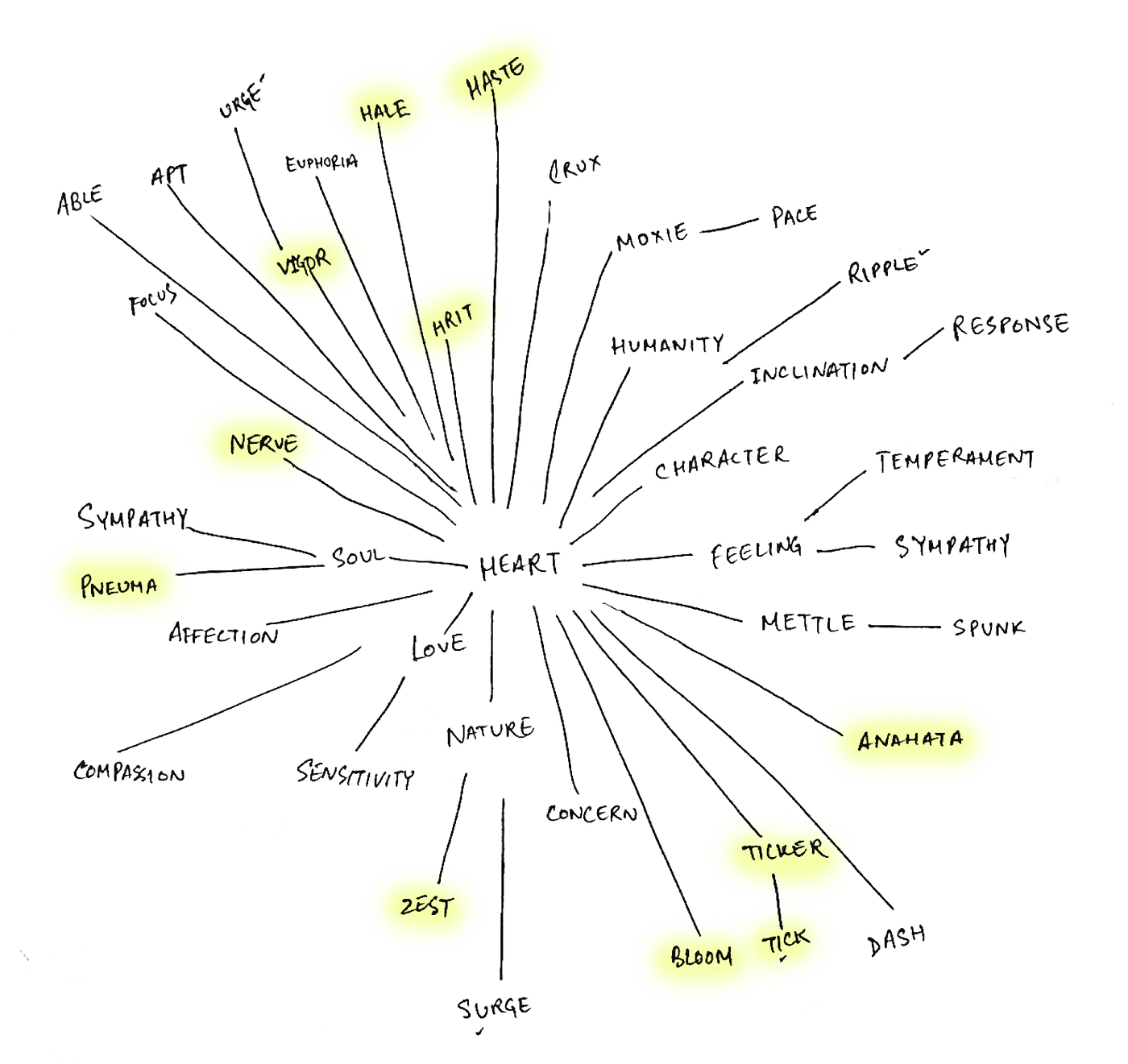
After a lot of user feedback, I settled down for "HRIT" as it has a meaning in itself which is directly related to the topic and has a uniqueness all in itself.
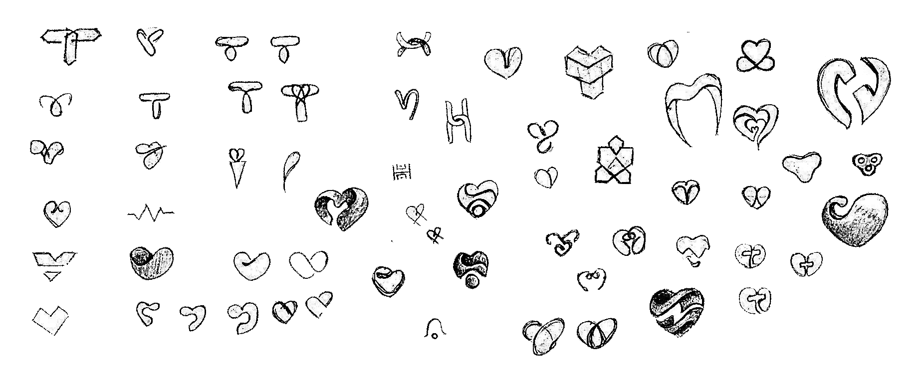
Logo Explorations
Initially, the name I selected was "Tick" for these logo variations. Therefore, they are abstract and geometric shapes forming a "T".
Later, "H" was used to create a form relevant to heart.
A bunch of heart-related shapes was also made to make it more to the point.

Color
The app is being made in India, so it has to have an Indian touch to it. India is mostly known for its culture, its festivals, and color. So the application has to have different bright colors in it. However, it should also have a balance for elderly users. Too much bright color can stress the eyes of the elderly users, hence a sweet spot has to be figured.
The colors also represent joy, energy, trust, calm and positivity.


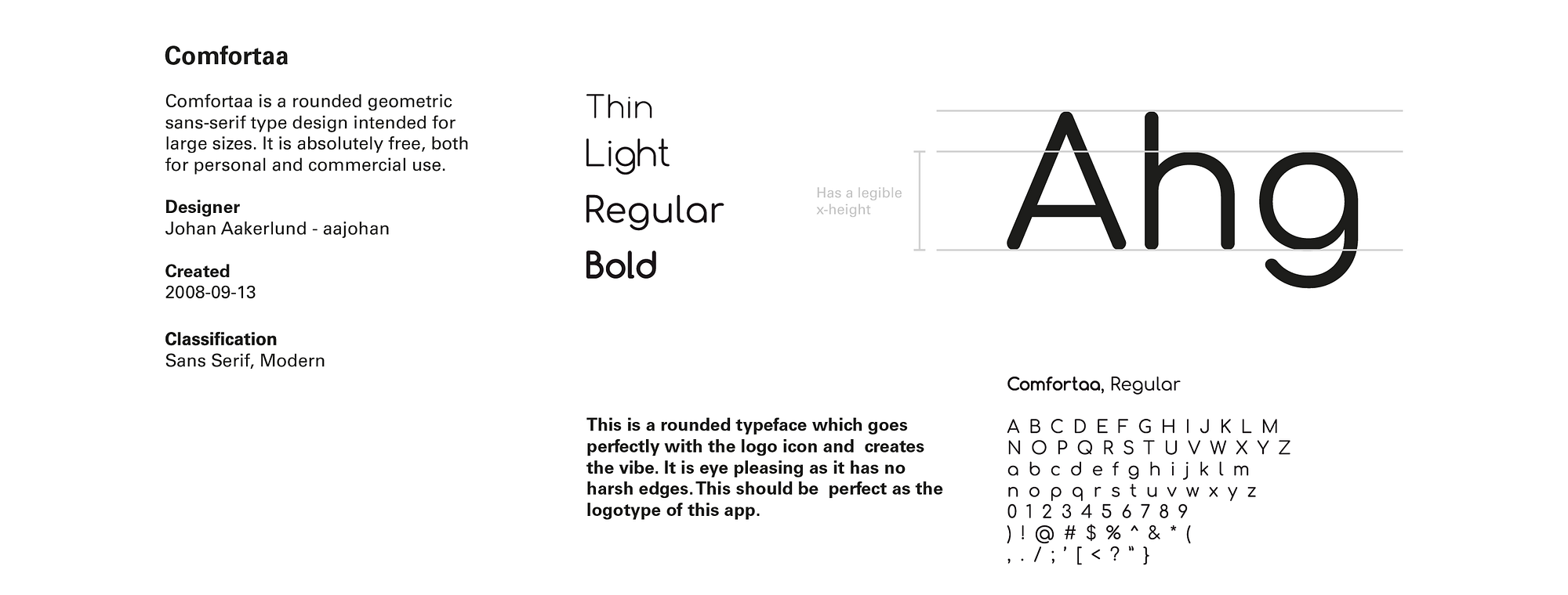
Typography
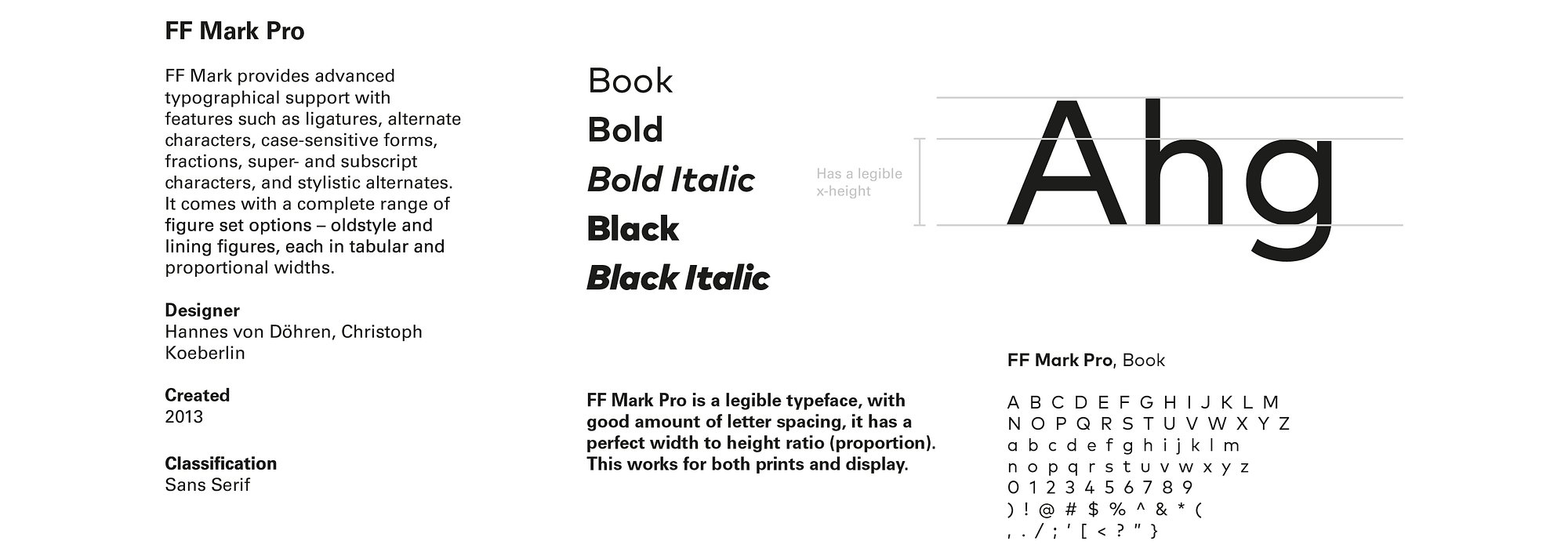
The story is different on web and mobile. For my application sans serif typefaces are more likely to go with the logo icon, than any other typeface class. A fusion of sans serif and modern typefaces would be perfect. It has a fun and playful vibe, which is the basis of the application.
Final Logo
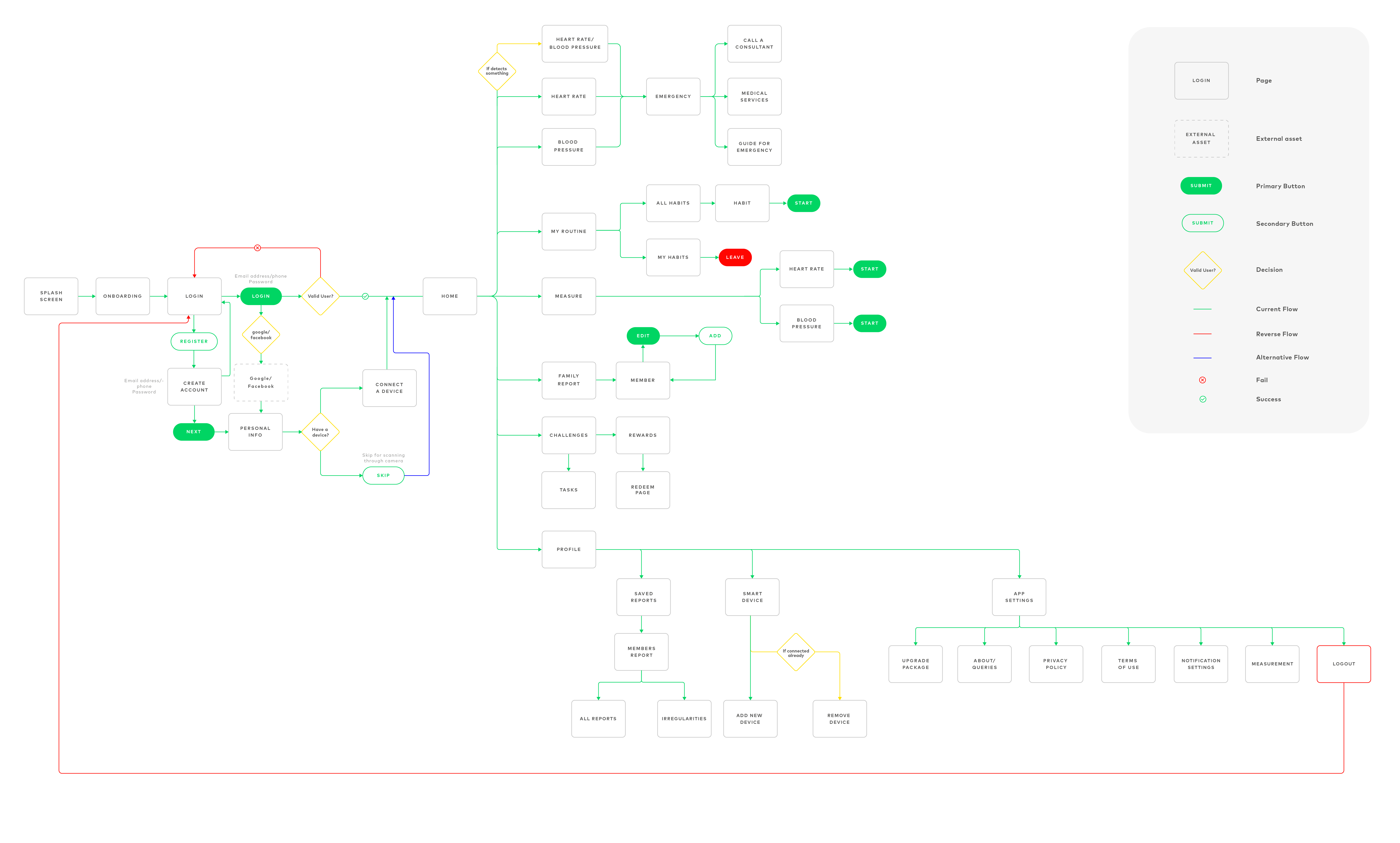
Information Architecture
Information Architecture is a blueprint of the design structure which can be generated into wireframes and sitemaps of the project. UX designers use them as the basic materials so that they could plan navigation system.
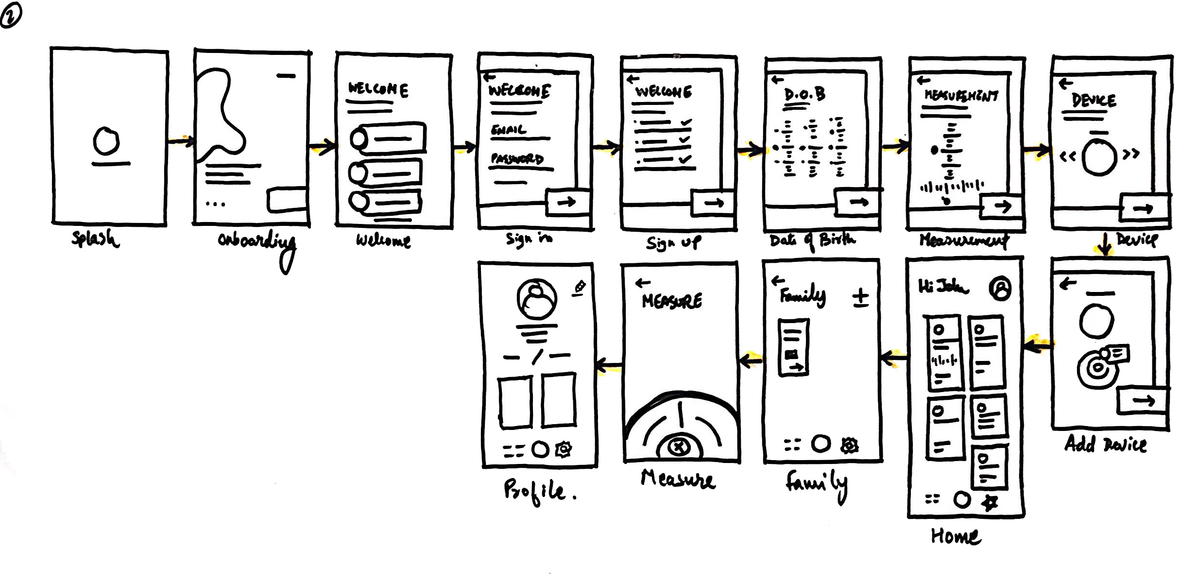
Wireframes
Concept I
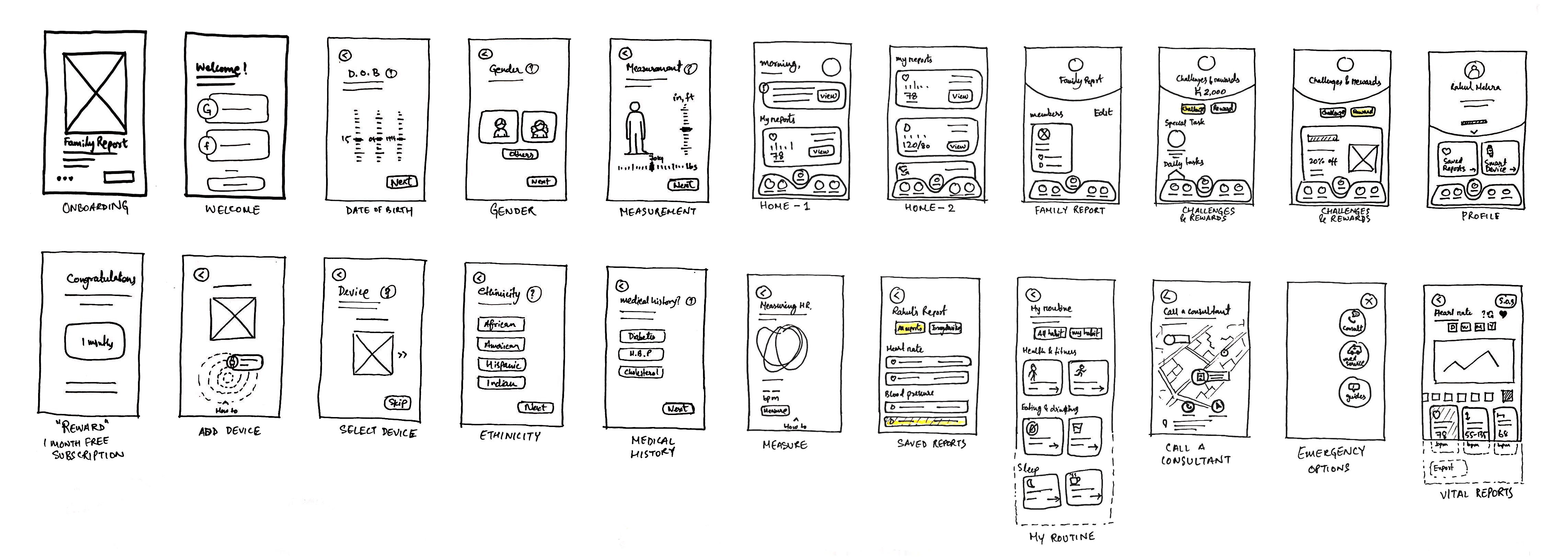
The first concept is a very simple and minimalistic approach. The wireframes have been kept as simple as they can get, with minimal information.
In this route, user reports are placed in rounded squares and rectangles. Grid was followed strictly in all the screens. A basic layout was set for further iterations.
The typeface used- FF Mark Pro.
Card UI is used to enhance the user interface and user experience. As an information container, cards hold all elements such as text, rich media, buttons, etc. It acts as an entry point to more detailed information. All the necessary tabs are placed in a horizontal bar in the bottom of the screen, for faster navigation.


Log in/ Sign up — Login or signup procedure starts by putting the email id and password.
Body measurements — Helps keep count of the BMI, and helps enhance the scanning result.
Home Screen — The home screen focuses on showing the users' vitals and a notification indicating a problem. Each piece of information has a card for itself.
Habits — Habits is a place from where you can start a fitness, food or sleeping habits, make it a routine and it will ask you every day if you achieved that.
Family report — The heading speaks for itself. The family report screen shows the vitals of the added family member in real time. Each card here will show a summarized report of the particular member.
Member's full report — This page will have an in-depth report of the selected member's heart rate or blood pressure.
Testing
User test was conducted after this concept and people found it boring after a point. The layout was simple but it needed more improvements. There was a need for cutting down user's registration time and making it more intuitive.
Concept II
The second concept was a bit off the grid.
I wanted to break the grid and explore a new way of representation of the card information.
There was a need to make the registration process intuitive. I tried focusing on user's registration experience. I also placed a white rectangle on the background to give it a more natural look, just like people filling up a form on a clipboard.
The typeface used- FF Mark Pro.
I added new user registration options. Signing in through google or facebook is a faster option, as there is no need of remembering the passwords and keeps our data safe with Cross Account Verification.
I have placed all the necessary information cards on the home screen itself, so all summarized information is available on the home screen. I have also made the cards smaller so that more information could fit in, in a single fold.

Sign in screen — Sign in through google or facebook is a faster option. You can use your Google Account to sign in and you won't have to remember individual usernames and passwords for each account and keep your data safe with Cross-Account Protection.
Birthdate — Providing the birth date helps hrit in understanding and the risk factor better whether or not detect small changes in the heart rate or blood pressure.
Body measurements — An improvement made in height and weight selection. It's in a way like the natural measuring scales are. For height, it is a vertical scrollable scale and for weight, it is horizontal as it is on a weighing scale.
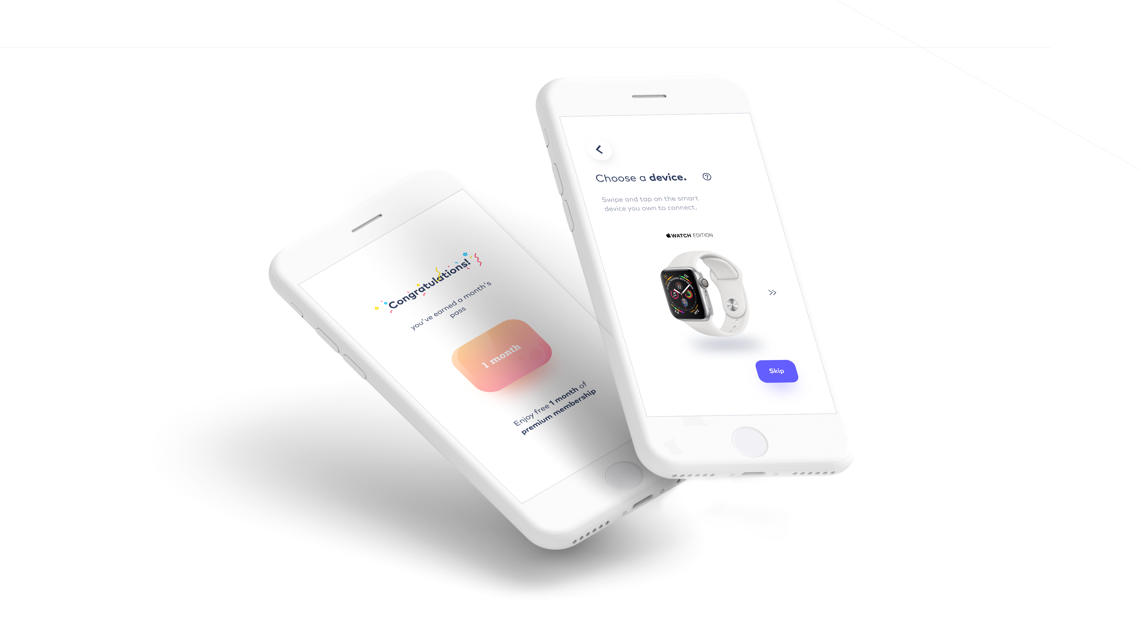
Choosing a device — Adding a device helps in routine scanning at particular intervals. Devices help in showing and providing real-time reports of the user or the family members.
Home screen — The new home screen is minimal in every aspect. It has smaller cards which help to see more information in a single fold. It has only three tabs which make the user navigate to important pages directly from the home screens cards.
Measure — The two options are in a circular navigation manner for reachability. If the app is not connected to a smart device it still can scan the heart rate through the phone's rear camera.
Testing
Another user test was conducted with the same group, and they reported the app to be very confusing after a point as users had to go back to the home screen in order to access other tabs. There were to many taps and navigations required which loses the customer attraction. There is a need of easy navigation and quicker information retrieval.
Users also took time in identifying some tabs.
Concept III
After the second concept, there was a need to reduce the number of taps for retrieving information. Earlier, the information was not in an organized manner. There should be a hierarchy of information. The design should not be intimidating or sophisticated for elderly users.
So, the tab bar is now changed and given a smooth flow. There are four tabs which makes it more organized, and enables quick information access.
The typeface used- FF Mark Pro.
I have cut down the user registration steps wherever possible. It is now intuitive and interactive. Attention to detail is also a primary focus.
This follows the same grid as the first concept, although it is very different from the initial attempt.
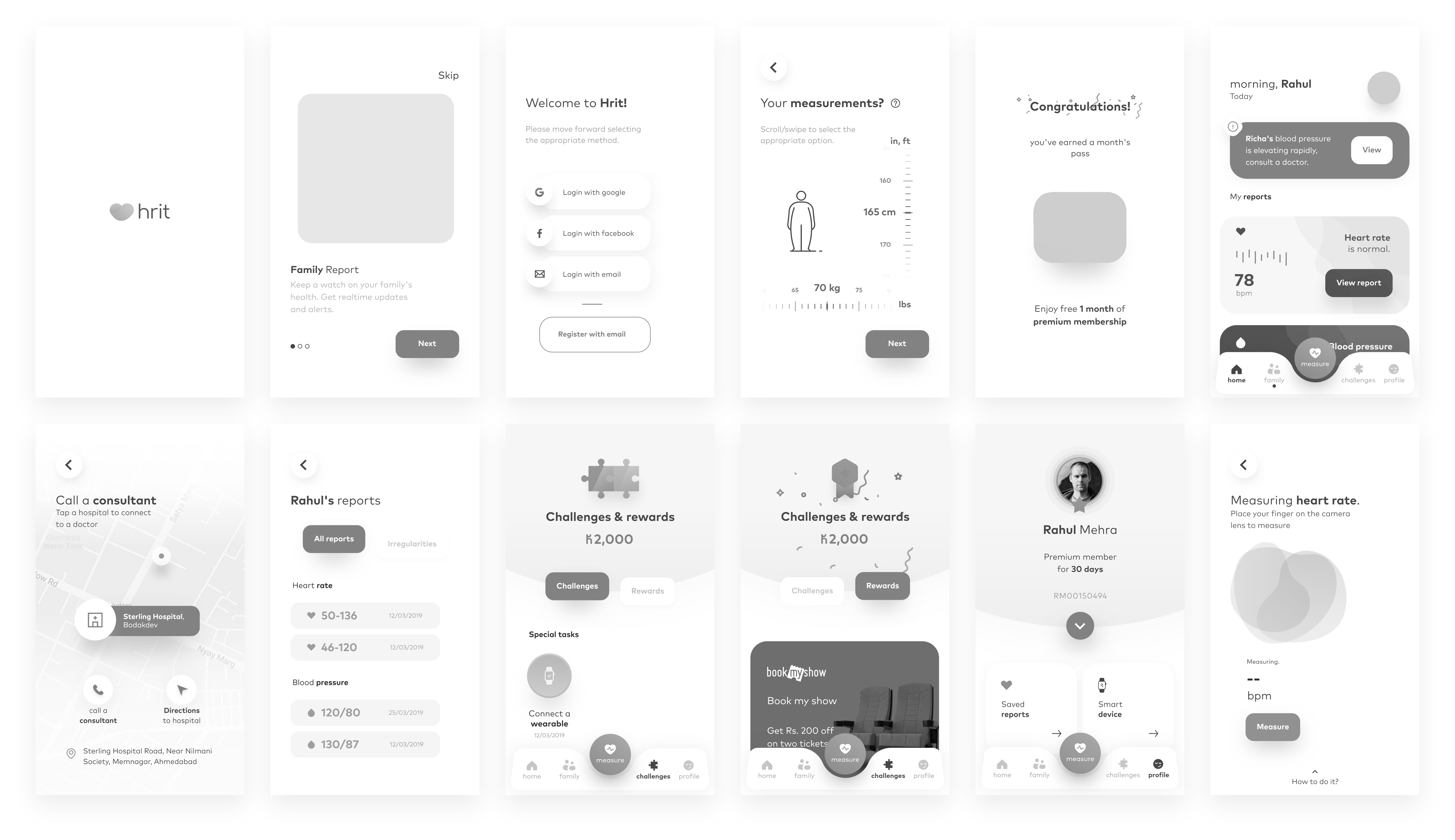
Splash screen — Splash screen is the first screen that comes up after launching an app. Hrit's splash screen has a short animation of a heart pumping and then it turns into its brand mark.
Onboarding screens — The onboarding screens of the app will let the user know of the minimum viable product of the app.
Sign in screen — The sign in screen is kept the same as the last concept, but the register with email is given some emphasis.
Body measurement — The scales are kept the same as the previous concept, but a human figure is added which mimics the persons' measurement as he scrolls through his height or weight. It gets fat or slim on the basis of BMI.
1-month pass — This is 1-month free pass enables usage of the premium features of the app for a month.
Home Screen — The home screen is clean and minimal with sufficient information in the vitals cards. There is an alert card which appears if any problem is detected in either user's or family member's vitals.
Tab bar — The tab bar is also changed given a smooth flow. There are four tabs which makes it more organized, and enables quick information access.
Call a consultant — This screen helps us locate trusted and hrit verified hospitals near and helps connect to a consultant or if the case is serious then a specialized doctor.
Saved reports — Users' or family member's report of a particular date can be saved and can be found in the saved reports with the respective user's or family member's card.
Challenges & rewards — This is where challenges and tasks are there which can be daily, weekly and monthly.
Upon completion of a challenge, the user is rewarded with hrit coins which can be used to get discounts and offers from partners like bookmyshow, 1mg, netmeds, etc.
Measure — This tab is especially for the people who don't own a smart device but is concerned about his health. User has to place his finger on the camera to start scanning his heart rate. If someone owns a smart device, tapping measure would start scanning through the smart device itself.
User profile — User profile contains the user's information, the unique ID (to be added in a family loop), the saved records, device card, and the application settings.
Testing
After a quick test, users seem to like the app interacting and reciprocating to users actions. They find it quite easy to read and identify and comprehend information, unlike the earlier concepts. But, yet there need to be slight tweakings.

"Design is not just what it looks like and feels like. Design is how it works." — Steve Jobs.
Inspiration
Material Design
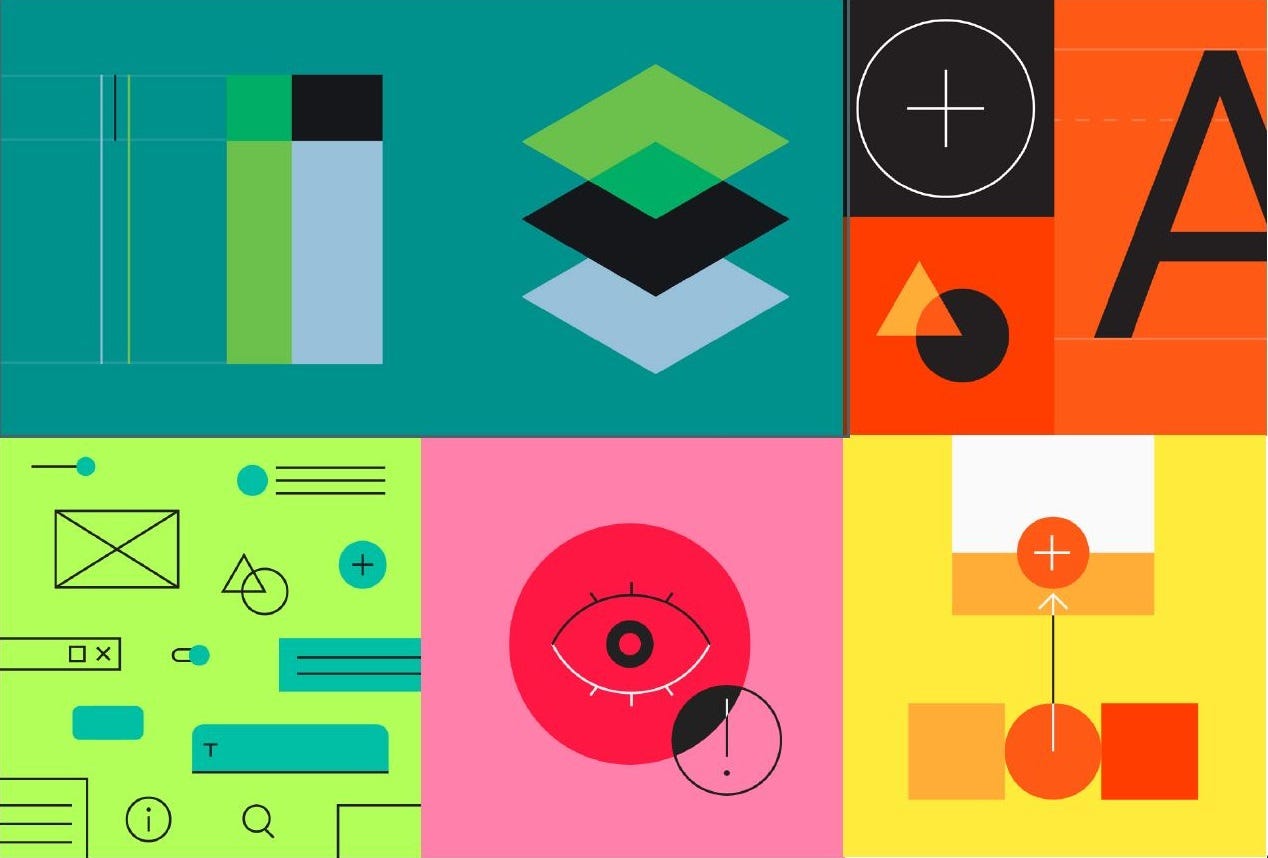
Material Design is inspired by the physical world and its textures, including how they reflect light and cast shadows. Material surfaces reimagine the mediums of paper and ink. Material Design is guided by print design methods — typography, grids, space, scale, color, and imagery — to create hierarchy, meaning, and focus that immerse viewers in the experience.
Key points to consider —
Hierarchical, Legible, Expressive, Clean, Minimal, Subtle, Informative
Onboarding Illustrations

Final Prototype
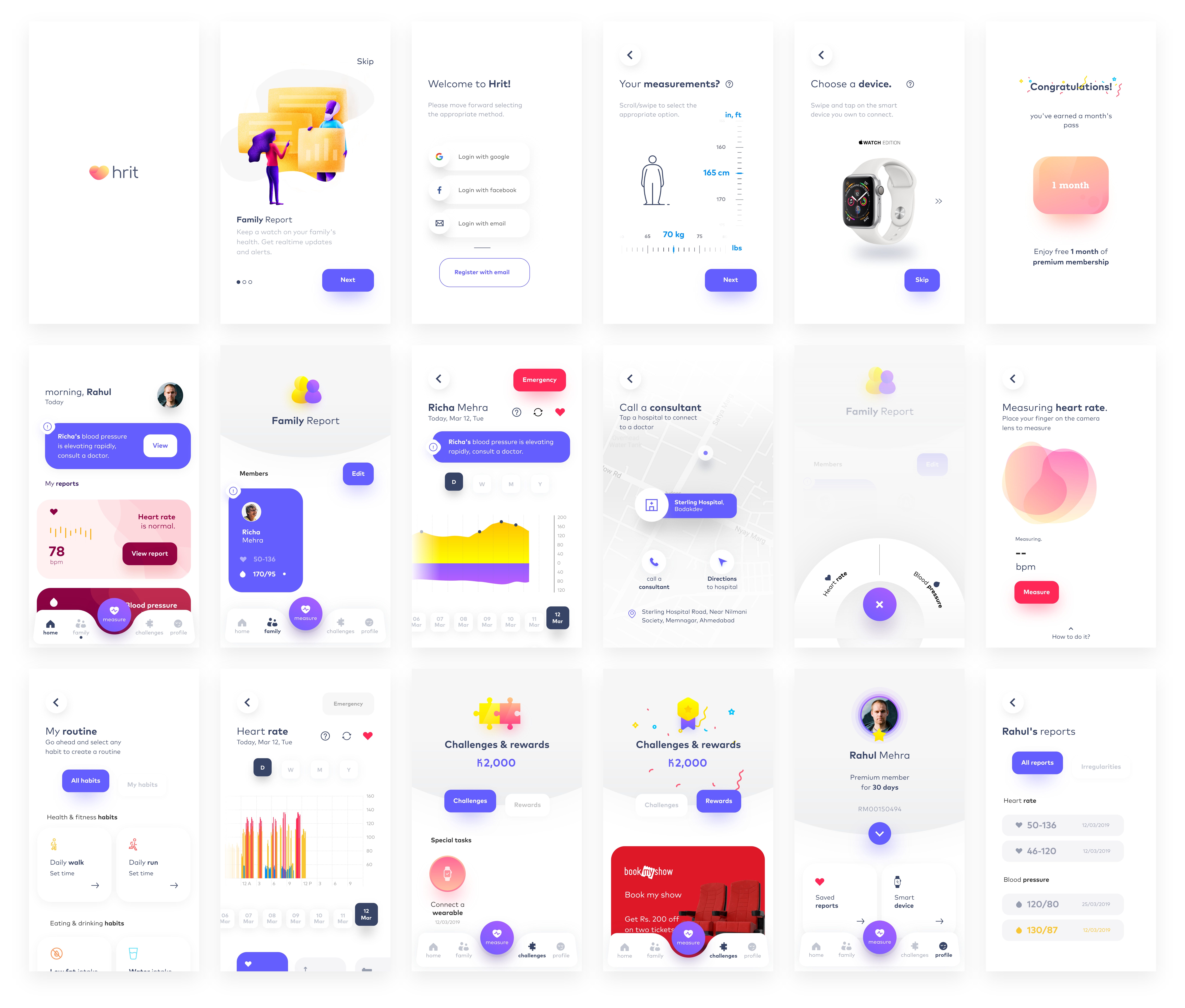
After the detailed wireframes of the third concept, It was clear what all I wanted and what not. Some additions and subtraction were done and finally started making the UI for it. The illustration with the same color palette is placed in the onboarding screens. Iconography with supporting text is also an interesting part of the screens.

My mark on the world
Everyone has their own way of contribution, I in my own little way made my contribution.
The purpose of this app is to make the user feel like there is someone to take care, an assistant, an informant that empathizes them.
This mobile application seemed to serve my purpose, as it will help figure out if someone needs medical attention, it will motivate users to engage in physical activities, and provide consulting service for those who seek help.
If this application is able to save one life, It would be worth the time and effort put in.
I am extremely grateful to have been able to work on this project. I wanted to work on a UI/UX project but never did I think that I would be able to actually make a difference and contribute to such an important cause. Not only have I learned about UI/UX, but I have also been able to understand the social touch in design. I realize how much it matters to not just make things that look good, but make things that bring a difference to the society in a better way.
I got to know about the heart diseases and was able to connect with the topic personally, which helped take a human-centric approach.
I also got in-depth insights into the technological world and what they have to provide us.
I have thoroughly enjoyed every bit of this project and I am happy to have been able to work on it from scratch. Starting with the basic research to the final prototyping, this project has given me a holistic understanding of this subject and an experience that I will remember and implement for the rest of my life.
My mentor Mr. Titu Mili also played a very important role in helping me successfully complete this project. Without his constant support and guidance, this would have been impossible. I feel very lucky to have worked with someone who understands this subject to the depths and who has always been there to help me out every time I got stuck somewhere.
— Saurav Pathak
Thank you for reading. Your feedback could be valuable for me and my growth.
My Behance Profile — https://www.behance.net/sobs420c7ff
Heart Monitor App Design And Production Stages
Source: https://uxplanet.org/hrit-mobile-application-for-maintaining-a-healthy-heart-a-case-study-36f30a01e85b
Posted by: martinezhileace.blogspot.com

0 Response to "Heart Monitor App Design And Production Stages"
Post a Comment